


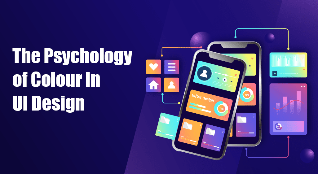
The Psychology of Colour in UI Design
Colour is a silent language in UI design; it speaks directly to the user’s emotions, perceptions, and actions. Whether it’s the calming hues of a meditation app or the vibrant reds in a discount banner, colour plays a pivotal role in crafting user experiences. By understanding the psychology of colour, designers can create interfaces that look stunning and resonate deeply with their users.
Let’s find out how colour influences user behaviour, the principles behind its application in UI design, and why mastering this aspect is crucial for aspiring designers. If you’re considering a UI design course, this article will provide valuable insights into one of its core elements.
Why Colour Matters in UI Design
Colour isn’t just about aesthetics; it’s a functional tool that shapes the user’s journey. Here’s why it holds such importance:
- Grabs Attention: Bright colours or contrasts draw the user’s eyes to critical elements, such as call-to-action buttons.
- Communicates Emotion: Different colours inspire different feelings, making aligning the UI’s tone with the brand’s message easier.
- Improves Usability: Colour helps categorise content and guide users intuitively through an interface.
Understanding these aspects is the first step toward designing interfaces to engage and delight your users.
The Psychology of Colour: What Each Hue Represents
Every colour has a psychological impact that designers can leverage to influence user behaviour. Let’s break down some commonly used colours in UI design:
1. Red: Energy and Urgency
- Symbolises passion, excitement, and urgency.
- Frequently used for notifications, alerts, and sales banners.
- Ideal for grabbing attention quickly but should be used sparingly to avoid overwhelming the user.
2. Blue: Trust and Stability
- Evokes feelings of calmness, reliability, and professionalism.
- Popular among financial institutions, tech platforms, and social networks.
- Effective for building user trust and encouraging prolonged engagement.
3. Green: Growth and Harmony
- Represents nature, balance, and health.
- Used in apps related to wellness, sustainability, or financial growth.
- Creates a sense of reassurance and positivity.
4. Yellow: Optimism and Caution
- It conveys happiness and enthusiasm but also signals warnings.
- Best for drawing attention to secondary elements or subtle highlights.
- Appear harsh if overused.
5. Purple: Creativity and Luxury
- Symbolises sophistication, imagination, and exclusivity.
- Often used in luxury brands and creative industries.
- Adds a touch of elegance to an interface.
6. Black and White: Simplicity and Clarity
- Black conveys power and elegance, while white represents cleanliness and simplicity.
- Used together, they create a timeless and minimalistic design aesthetic.
How to Use Colour Effectively in UI Design
A thoughtful approach to colour usage can make or break a design. Here are some best practices to ensure your colour choices enhance user experiences:
1. Establish a Colour Palette
Define a cohesive colour palette that reflects the brand identity and ensures consistency across the interface.
- Primary Colours: Used for main elements like headers or primary buttons.
- Secondary Colours: Complementary hues for accents and highlights.
- Neutral Colours: Backgrounds and text for readability.
2. Leverage Contrast for Readability
High contrast between text and background improves readability, especially for users with visual impairments. Use tools like contrast checkers to ensure compliance with accessibility standards.
3. Apply the 60-30-10 Rule
This timeless design principle helps maintain balance:
- 60%: Dominant colour (e.g., background).
- 30%: Secondary colour (e.g., content blocks).
- 10%: Accent colour (e.g., buttons or highlights).
4. Consider Cultural Contexts
Colours can have different meanings in various cultures. For instance:
- White symbolises purity in Western cultures but mourning in some Asian traditions.
- Red signifies good fortune in China but danger in other contexts.
5. Test Colour Choices Across Devices
Colours can appear differently on various screens. Always test your design on multiple devices to ensure consistency.
Mistakes to Avoid When Using Colour in UI Design
Even experienced designers can fall into common traps when working with colour. Avoid these pitfalls to create more effective interfaces:
- Overloading with Colours: Using too many colours can confuse users and dilute the message.
- Ignoring Accessibility: Failing to account for users with colour blindness can alienate a significant portion of your audience.
- Relying Solely on Colour: Always pair colour with text or icons to communicate functionality.
- Neglecting Brand Identity: Ensure the colours align with the brand’s values and messaging.
Real-World Examples of Colour Psychology in Action
1. Facebook’s Blue Interface
Facebook’s consistent use of blue conveys trust and calmness, encouraging users to spend more time on the platform.
2. Spotify’s Black and Green Scheme
Spotify’s sleek combination of black and green reflects its modern and energetic brand identity.
3. Amazon’s Orange Add-to-Cart Button
The orange button draws attention to the primary action, boosting conversion rates.
How Learning Colour Psychology Can Enhance Your Career
Understanding colour psychology isn’t just a bonus; it’s a necessity for UI designers. By mastering this skill, you can:
- Create designs that emotionally connect with users.
- Increase user retention through intuitive interfaces.
- Stand out in a competitive job market by showcasing advanced design knowledge.
If this fascinates you, a UI design course can help you get deeper into these concepts and apply them effectively in your projects.
Start Your Journey in UI Design
At Arena Animation, Park Street, we offer comprehensive courses that cover everything from colour psychology to advanced UI development techniques. Our UI development course equips you with the skills to design user interfaces that not only look beautiful but also function seamlessly.
Transform your passion for design into a rewarding career. Enrol in our UI development course today and create interfaces that captivate and inspire. For more information, visit Arena Animation, Park Street.


