How to Take User Interface to the Next Level with Animation
When we hear about animation, most of us think of cartoons and video games. In reality, animation is everywhere around us. We live in a time where applications and websites that sell products/services get more visits than physical stores. Thus, it is now vital to give the virtual experience a realistic look and feel, and animation is paving the way for this.
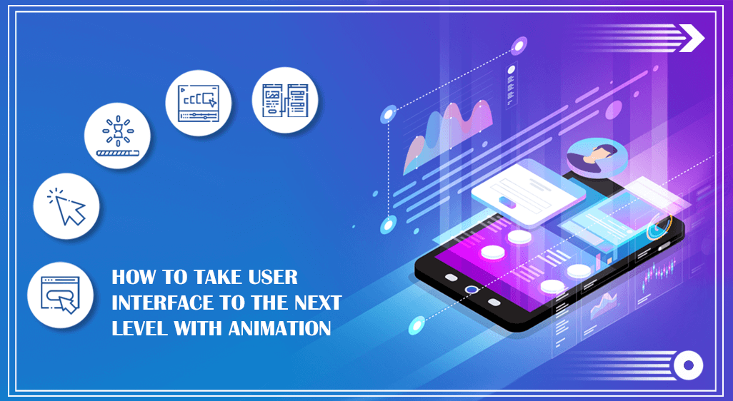
Animation aids a user’s navigation around a website, from scrolling down a page to receiving notifications. This, in turn, may provide a website with a narrative impact while also attracting users’ attention with some dynamic features. If you’re a UI designer looking to improve your talents, read on to discover some intriguing UI animation techniques that can help you take your design game to the next level.
What is UI Animation?
The practice of introducing a motion to elements of the user interface (UI) to boost a website’s interaction is known as UI animation. It impacts users’ decisions in addition to directing them through and around the interface. UI animation lowers the mechanical feel of a website or app by generating a natural and intuitive experience.
In the early years of online presence, web designers used to overload their interfaces with animated gifs and bright colours. However, as the years passed, people came to know that excessive use of animated elements degrade the quality of a site, which eventually results in the loss of users. As a result, designers started putting more focus on enhancing the user experience instead of decorating the websites. There came a turning point in web designing when designers started mimicking the real-world properties and started dealing with the speed, weight, and gravity of different elements for realistic UI animation.
Why UI Animation is Important?
User expectations are on the rise as the number of applications and websites has increased tenfold. People want an online experience that is useful, powerful and offers distinctive features that allow them to navigate the website easily. Fortunately, the only method to make a website design human-centric and responsive is to include animation.
Animation replicates the interaction experience between a website and real-life objects while adding an essential human touch. It keeps people informed at all times while providing real-time updates and feedback. Furthermore, animation adds visual appeal to a user interface, encouraging it to be unique. All you need to know is how to use the appropriate number of design elements on a website to prevent causing confusion and an excessive impact. Why not enrol in a reputable institute like Arena Animation to learn the best UI design practices? Visit their website to know more.
What Are the Different Kinds of UI Animation?
Though designers categorize animation for UI in their way, the most common types are divided into four groups –
1. Navigation
Hover animations, visual hierarchy, swipeable layouts, and arrows are all examples of navigational animations that help users navigate the interface. Users feel confident about their future steps if these components are present.
2. Micro-interactions
Micro-interactions happen when an action is completed on a website. Even if an action is unsuccessful, it helps users to visualize the result of each action. Getting a silent icon upon switching your phone into silent mode, moving a toggle or scrolling down a page, or pressing a button are all examples of micro-animation.
3. Loading and progress
No one likes waiting, especially when the duration of the wait is unknown; this is when loading and animations come in handy. Progress bars and pull-to-fresh functions are two examples of elements that can relieve stress while also providing a sense of progress.
4. Branding and storytelling
Captivating animations are frequently used on welcome screens to keep users hooked to your website. It’s an excellent approach to reinforce the brand’s identity and communicate its narrative in a matter of seconds. It could be a fun and engaging approach to demonstrating products or services. An animated logo is the best example of branding and narrative animation as it effectively communicates your brand message to the world.
Principles to Follow for UI Animation:
The Disney test must be passed while creating animation. Classic Disney animation principles are used for everything that happens onscreen. These principles provide a valuable framework for effective and comprehensive animations across digital interfaces when it comes to achieving the realistic motion of website elements –
- Squash and Stretch: When some elements come into contact with other objects, they can alter form. Squeezing and stretching provides the same results as hitting a button. You may use this concept to add interactive characters to any UI element whose state might change as a consequence of specific actions.
- Anticipation: It refers to imminent action. The hover state, for example, is a wonderful illustration of anticipation since the button can change colour. These effects make users anticipate what will happen when they press the button.
- Staging: It’s a way to influence the user to press a certain button or fulfil certain actions by staging or organizing the elements in a specific way. For example, adding the “you might like these” feature on the checkout page along with the “add to cart” button influences the shoppers to shop more.
- Follow through and overlapping action: UI elements can move at varied rates or overshoot the motions before arriving at a resting position while replicating real-life activities. Even minor differences in acceleration and pace can make each element appear more realistic.
- Easing: Slowing in and out is referred to as the easing effect, where the viewers can see some gradual movement of the UI elements. You might have noticed how real-life objects appear and the UI elements must come up with the same effects. Instead of popping an element suddenly, adding a fade-in animation effect create a more natural look.
- Arcs: Rather than using grids to develop user interfaces, arcs are utilised to indicate an element’s route to create responsive designs. The slider bar may adopt the appearance of a ball with a curving motion when transitioning from desktop to mobile mode.
- Secondary action: The micro animations are the secondary actions that support and enhance primary actions. For example, you might find the shoelace of a person moving up and down while a character walks in animated scenes or the pulsing of a button when it prompts a user to press it.
- Timing: The sequence and order in which UI components appear are referred to as timing. Users can be frustrated if the animation is too slow, while users may miss vital information if the animation is too fast. As a result, it’s critical to arrange the pieces according to their function.
- Exaggeration: Animations can be exaggerated to attract users’ attention while also offering designers greater creative freedom, and they can mirror the authenticity of real-world objects.
- Appeal: With some soulful colours, you can add charm to the micro animations and make them appealing to the users. Those animations which often go unnoticeable can elegantly serve their purpose if designers make them appealing.
- Solid drawing: Solid drawing refers to 3-dimensional animation and sometimes the symmetry of 2-dimensional animation eliminates the illusion of a 3D object.
- Straight ahead vs pose-to-pose: This principle helps to differentiate between starting an animation with a pose and creating subsequent frames to fill the key poses.
Apart from adhering to these key principles, ensure that the animation provides value to the user experience, allows for a seamless transition from one screen to the next, changes state efficiently, and never compromises the UX.


